A checkout that sells the membership
Making product and membership work in the same purchase, for an e-commerce store that sells at cost price
Company
ETIQL
Role
Product consultant and UX lead
Team
Client founders
In-house designer
UI designer
Visual designer
Shopify developers
Tools
Figma
Miro
Notion
Shopify
Client overview
ETIQL is an e-commerce store founded in Hamburg that sells fashion, home and lifestyle products at transparent cost price. It doesn’t make money from product markups but from the membership, annual or for a single day, that gives access to those prices.
Context
A store that earns from the membership, not the markup
I have worked with ETIQL since January 2021, when the project was still called Onest. I started with the value proposition and the brand sprint with the founders, to give the model a clear shape before the investor pitch.
In 2022 the focus moved to the website. The membership was added to the cart on its own: a 75 € item reached the checkout at 171 €, and nobody had explained why.
The question I started from was simple: why would someone buy this membership? And when is the right moment to tell them about it?
Experience
When to bring up the membership: upfront or at checkout
I took apart, step by step, the checkout of companies using the same model, on desktop and on mobile, and narrowed the choice down to two paths to prototype:
- Membership upfront: you discover it before entering the shop and add it to your cart
- Membership at checkout: you browse and pick your products, the plans appear when you go to pay
We chose the second: the shop stays open to everyone and the membership comes in when the person already has a reason to want it.
With the relaunch of the e-commerce on Shopify, in summer 2022, that choice turned into six use cases: people buying only the membership, first-time buyers, people with an expired plan. For each one I defined the flow with the founders and led the UI work, the documentation and the handover to development.
Four decisions shaped the checkout:
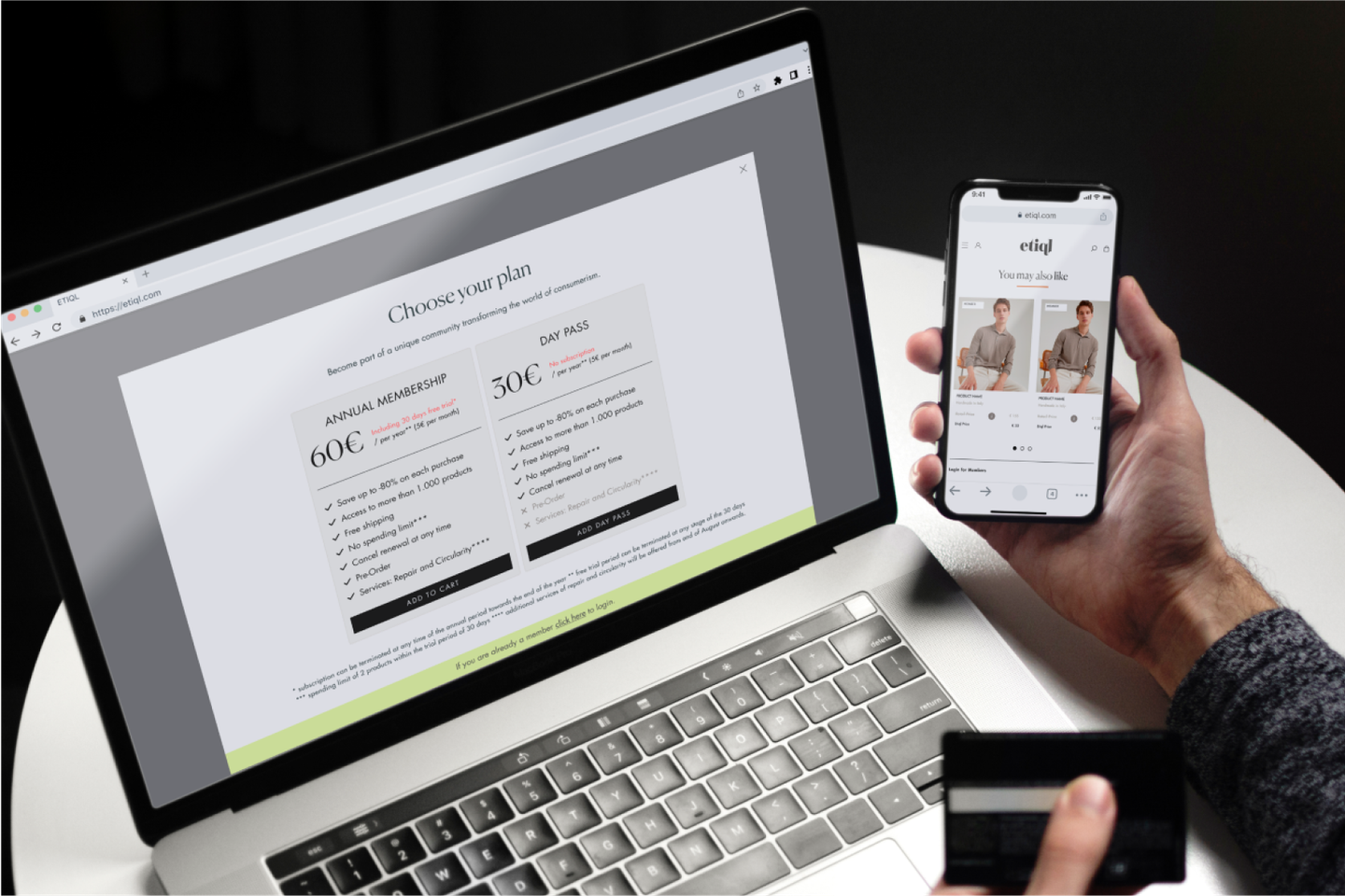
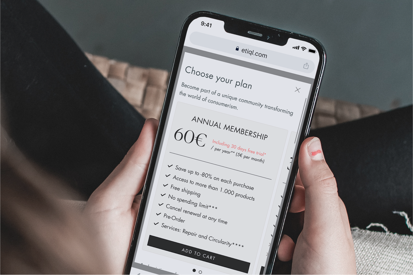
- Choosing a plan is an explicit step in the cart, before paying
- First-time buyers are offered the annual plan by default
- A one-day pass lowers the barrier for those who don’t want to commit
- From the shipping details onwards there is a single checkout for everyone, within the Shopify standard

“The goal is to simplify and clarify the experience, not to reinvent it”
Process and activities
Phase 01
Strategy

Discovery
Value Proposition Canvas and brand sprint with the founders
Site and analytics assessment
Benchmark of membership e-commerce stores

Analysis
Hypotheses to validate, defined with the client
Three buying profiles: discount, quality, awareness
Interview and focus group plan
Phase 02
Design

Definition
Two paths: membership upfront or at checkout
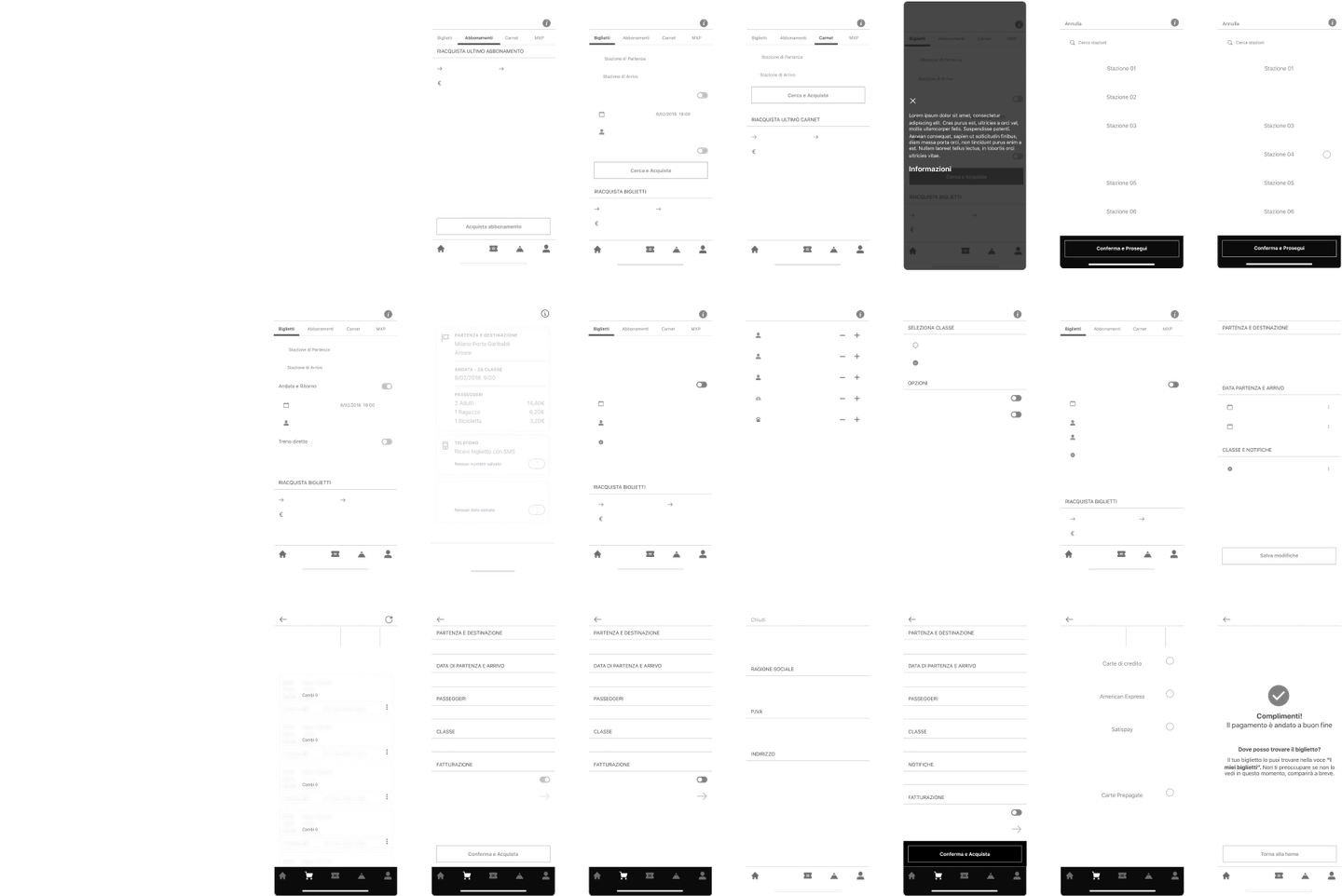
Six checkout use cases
Rules for calculating the membership in the cart

Drawing
Desktop and mobile flows and prototypes
Cart and checkout UI (with the UI designer)
Homepage and product page (with the visual designer)
Phase 03
Feedback

Prototyping
Landing pages and ads for each profile
Checkout documentation in Notion
Handover to Shopify development

Testing
Checkout review in staging
Test scenarios for every use case
Cross-browser testing before go-live
Phase 04
Loop

Measurement
Analysis of checkout drop-offs on Shopify

Iteration
2025 review of catalogue, product page and pricing
A closer look at some activities
Use case mapping
Documentation and handover
Data collected
- 5+
Years
- 6
Cases
- 3
Profiles
- 2
Paths
Some of the assets produced
We designed cart and checkout for every use case, from desktop to mobile, within Shopify’s limits
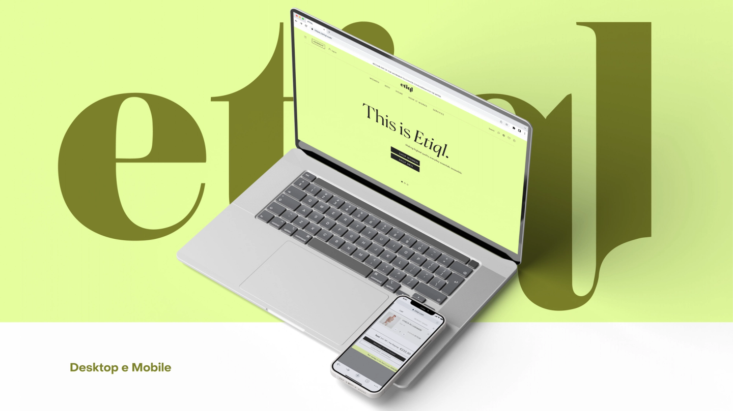
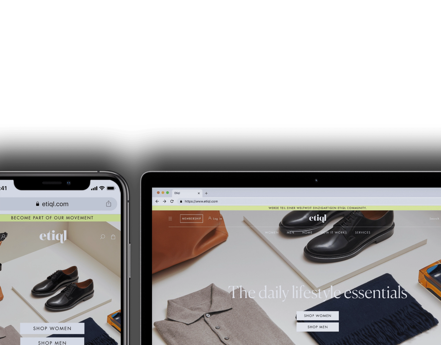
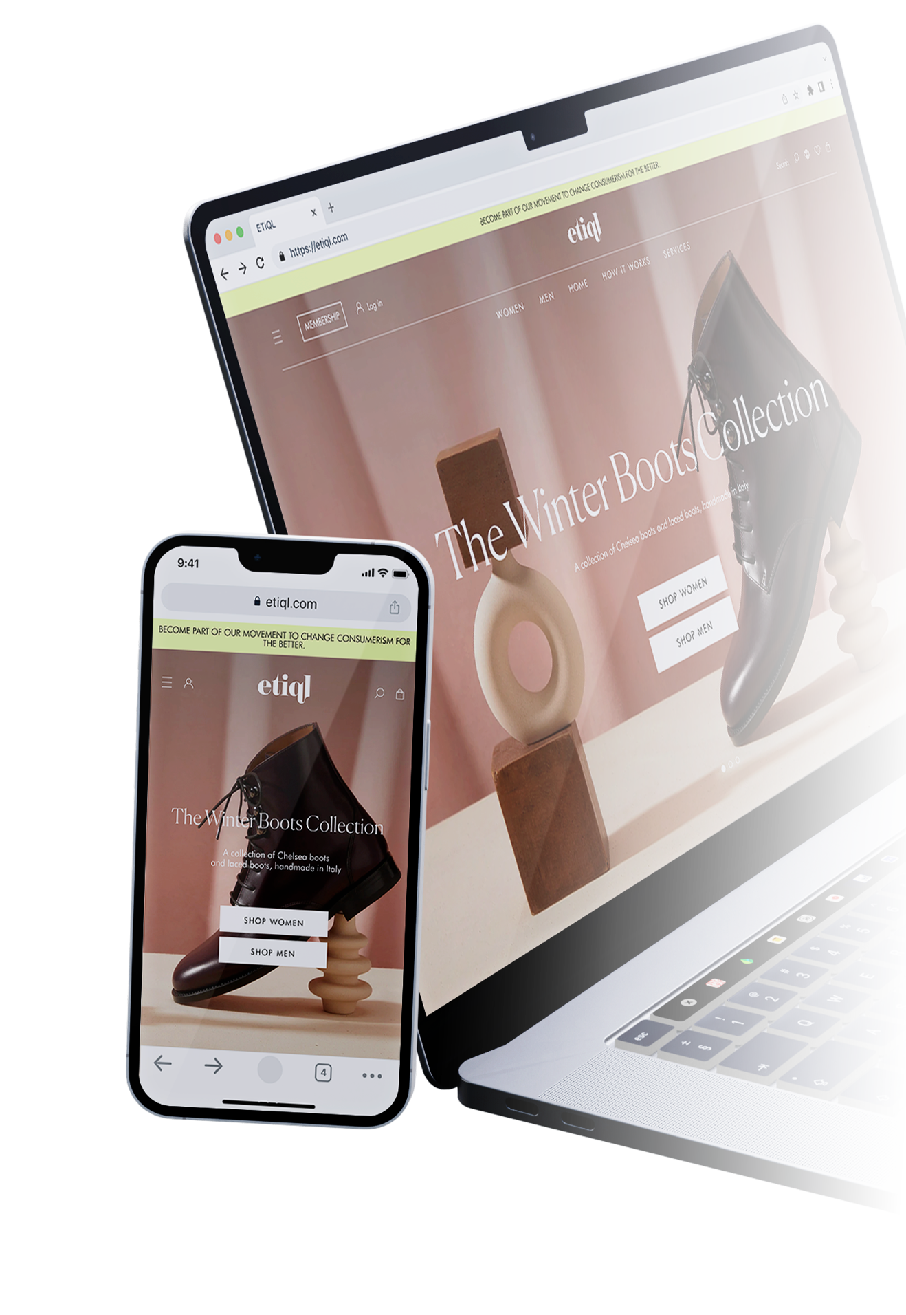
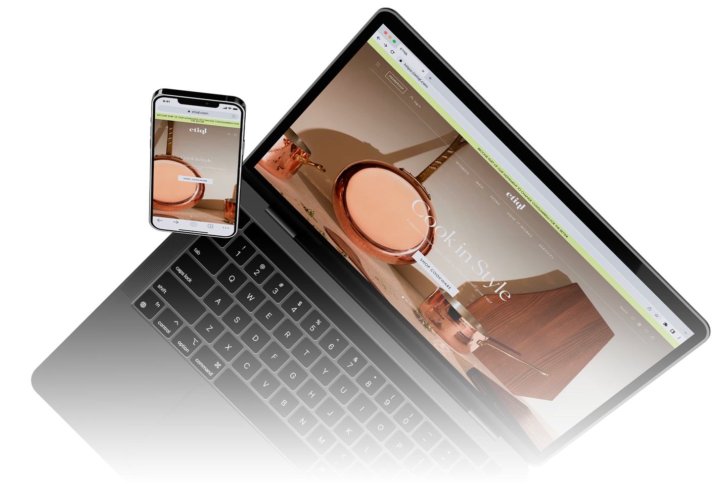
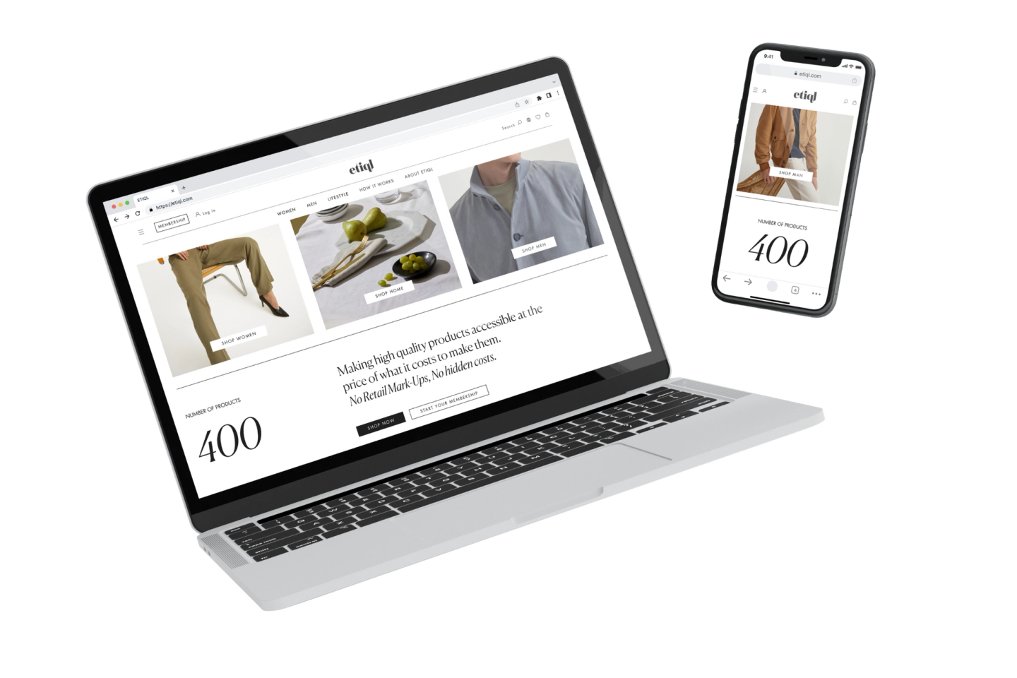
The ETIQL homepage, desktop and mobile

The cart with the plan selection
What I learned on the project
With ETIQL I learned that the handover to development is part of the project, not the end of it.
The first handover to development, on the login pages, went badly: field states, typography and colour references, and copy in both languages were all missing. We reworked the design system, and from then on every handover went through an approval and written documentation.
I also learned to state dependencies early: in e-commerce my work depends on development and marketing, and it pays to make that clear before promising a date.
Research numbers
3
Landings
3
Ads
Value delivered to customers and team
For shoppers a clear plan before paying, for the team a checkout documented case by case.
The new checkout went live in November 2022 with the relaunch of the e-commerce. The first weeks showed where more work was needed: the journey of first-time buyers.
In 2025 I came back to the product to review the catalogue, the product page and how the price is communicated, and to move the checkout towards a single page, starting from the drop-off data.
The plan structure defined back then is the one still on sale: annual with a 30-day trial, and a one-day pass. Today ETIQL reports more than 10,000 members on its website.
Project numbers
10k+
Members
2022
Launch
Want to work together?
Read about my experience in the CV below.
Before downloading it, I will ask you a few questions in a short form.
Alcuni progetti